Satellite and Surface Temperatures
By Andy May – March 13, 2022
In the Great Climate Change Debate between Professor David Karoly and Professor Will Happer, Glenn Tamblyn was called upon to finish the consensus side of the debate after Karoly backed out. The details are described in my latest book. The debate contained an illuminating exchange of opinions on satellite versus surface temperature measurements. This is Glenn Tamblyn’s opinion:
Satellites measure microwave radiation emitted from oxygen atoms in the atmosphere to estimate the “brightness” temperature, which can then be converted to an actual atmospheric temperature. No correlation to any other measurements is required. The measured brightness is compared to the brightness temperature of deep space (-455°F) and a target of known temperature within the satellite to compute the actual temperature in the atmosphere.[i]
Due to interference and clouds, this technique does not work close to the surface, so satellite atmospheric temperatures cannot be directly compared to surface measurements. The satellite measurements are best for measuring air temperatures in the mid-troposphere and the lower stratosphere.
The Hadley Centre has estimated that their best current estimate of global monthly average SST accuracy (sea surface temperature average uncertainty from 2000 to 2021) is about ±0.033°C and David Karoly supplied an estimate of ±0.1°C. This is a bit less accurate than the accuracy Roy Spencer and John Christy estimate for their satellite measurements of ±0.011°C for a monthly average.i
Given these peer-reviewed analyses, we can comfortably assume that the satellite data is at least as accurate as the surface data, if not more accurate. Besides, the satellite data covers a larger volume of the atmosphere, and it uniformly covers more of the globe than the surface data.
Tamblyn seems to think that because the data used to create the satellite record is from multiple satellites, this necessarily means the satellite temperature record is less accurate. This is incorrect, the satellites are merged with an accurate procedure described by John Christy.ii
We also need to remember that the surface measurements are made in a zone with great volatility and a large diurnal variation. The satellites measure higher in the atmosphere, in a more stable environment, and are better suited to estimating climate change, as opposed to surface weather changes.
In Figure 1, the UAH satellite lower troposphere temperature record (light blue) is centered at about 10,000 feet.[ii] It is compared to the Hadley Centre sea surface temperatures (HadSST4, in gray) and the land and ocean surface temperature dataset (HadCRUT5, in orange).
Happer, clearly states that the satellites are measuring a different temperature and have consistent, nearly global coverage. Ground measurements, on the other hand, are sparse, irregularly spaced, and made with many different devices.[iii]
In Figure 1 we can see the HadSST and the UAH satellite lower troposphere warming trends are identical at 0.14°C/decade. The major difference is that the El Niños and La Niñas are more extreme in the lower troposphere than on the surface. Two prominent El Niños are visible in 1998 and 2016. Prominent La Niñas have the reverse relationship to the El Niños as seen in 2008 and 2011.
The HadCRUT5 dataset is well below the other two in the beginning of the period and above at the end. It has a warming rate of 0.19°C/decade. This 36% increase in warming rate is entirely due to adding land-measured surface temperatures to the SSTs, even though land is less than 30% of Earth’s surface.
Figure 1 leads us to three important conclusions. First, the El Niño years support the idea that a warmer surface will lead to more evaporation, which carries heat from the ocean surface to the lower troposphere; the same process that carries heat from an athlete’s skin into the atmosphere. As the evaporated water condenses to droplets, usually in clouds, it releases the heat of evaporation into the surrounding air. The lower troposphere UAH temperature, plotted in Figure 1, is most sensitive to temperatures around 10,000 feet, but it includes some emissions below 6,500 feet, which is a common altitude of lower clouds.
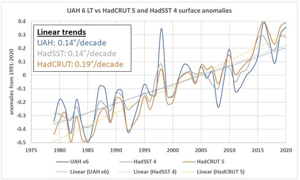
Figure 1. HadSST is in gray, HadCRUT global land plus SST in orange and the UAH global land plus ocean in blue are compared. HadSST and UAH have nearly the same warming trend of 0.14°C/decade. HadCRUT land plus ocean is higher at 0.19°C/decade.
Second, since the overall rate of HadSST warming is about the same as the UAH lower troposphere warming, it suggests that the extra warming in the HadCRUT5 land plus ocean dataset is suspect.
Third, if HadCRUT5 is correct, it means the surface is warming faster than the lower and middle troposphere. If this is true, the IPCC Reports and models suggest that the warming is not due to greenhouse gases.[iv] It could be that additional warming in the troposphere, above 6,500 feet, is due to El Niños and not due to GHGs. It is hard to accept that the data plotted in Figure 1 is both accurate and consistent with the idea that greenhouse gases are causing surface warming.
In summary, both common methods of determining the global average temperature, satellite, and surface, are probably accurate to within a tenth of a degree, as suggested by Karoly. Both methods show the world is warming, but currently the HadCRUT5 surface warming estimate of 0.19°C/decade is significantly higher than the satellite lower troposphere and SST estimates of 0.14°C/decade. The excess surface warming is entirely due to land measurements or adjustments to them. The adjustments made to the CRUTEM5 land surface temperature measurements are significant and controversial as explained by Peter O’Neill and an impressive list of coauthors.[v] The justification for the 36% increase in warming rate between the ocean and the land plus ocean records is not clear and probably indicates a problem with the CRUTEM5 land temperature record, the greenhouse gas warming hypothesis, or both.
Download the bibliography here.
[i] (Spencer & Christy, 1990)
[ii] (Christy, Spencer, & Braswell, 2000)
[iii] (Kennedy, Rayner, Atkinson, & Killick, 2019) and (Karl, Williams, Young, & Wendland, 1986)
[iv] (IPCC, 2021, pp. Figure 3-10, page 3-162) and (IPCC, 2013, pp. Figure 10.8, page 892). The dependence of the higher tropospheric warming trend on the CO2 greenhouse effect is most easily seen in the 2013 AR5 report since they present natural warming in blue and greenhouse warming in green in their figure.
[v] (O’Neill, et al., 2022)
Andy May is a petrophysicist, paleoclimate expert, member of the CO2 Coalition, and author of four books on climate and Kansas history. His latest is The Great Climate Debate: Karoly vs. Happer.