EPA Uses Misinformation to Promote Climate Fear
By Gregory Wrightstone
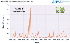
One year ago, if you had visited the Environmental Protection Agency’s (EPA’s) page on heat waves (Climate Change Indicators: Heat Waves) you would have found the lead chart to be the one below (Figure 1). It shows that heat waves peaked 90 years ago and have been at a relatively low level (thankfully) since that time. (Note: To access the heat wave index line graph shown below, you must click “Figure 3” on the source link.)
Since the government allows nothing good about our modern climate to be presented, the above chart has been replaced with the one below (Figure 2). It shows an alarming increase in frequency and intensity of heat waves. (Note: The bar graphs appear by default when accessing the source site.)
![]()
As you have likely guessed, there is more to this story than first meets the eye. First, the chart begins in 1961, near the end of a 33-year cooling period that had some of the coolest temperatures since the 1930s and conveniently omits the high temperatures of that decade of the “Dust Bowl”.
Second, and more importantly, the charts above are not representative of America but, rather, are heat measurements in the 50 largest metropolitan areas in the Lower 48 states. As you may be aware, the Urban Heat Island Effect has artificially increased urban temperatures greatly over the last several decades. (Source: https://www.epa.gov/heatislands)
This fact is revealed only deep within the fine print of the description of the methodology used. The authors DO admit that “Urban growth since 1961 may have contributed to part of the increase in heat waves…” Indeed. (Source: Climate Change Indicators: Heat Waves | US EPA )
Gregory Wrightstone is a geologist; executive director of the CO2 Coalition, Arlington, VA; and author of Inconvenient Facts: The Science That Al Gore Doesn’t Want You to Know.